Urban Juicer
TIMELINE
Jan 2024— Feb 2024MY ROLE
Sole Product DesignerINTRODUCTION
MOOD BOARDS
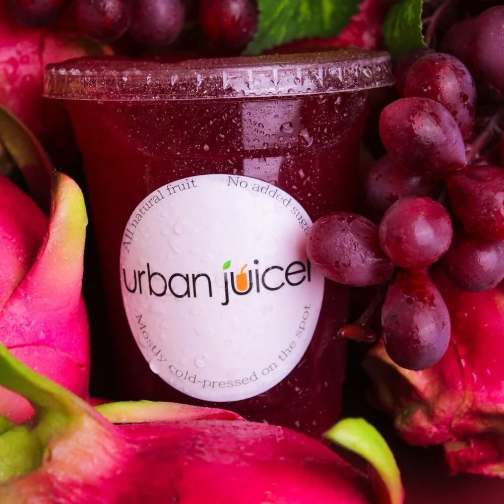
Urban Juicer is a fresh, lively, and energizing brand and we wanted our customers to feel that right at first sight.
So, I aimed to sample a moodboard that aligned with the brand’s unique identity.
PHOTO EDITING
FINAL CONTENT
Urban Juicer is a Malaysian-based juice bar located in Kuala Lumpur. Urban Juicer lacked a consistent online presence and, additionally, the brand did not have a consistent style and theme. The purpose of the campaign was to deliver high-quality images and increase social media interactions, as well as guiding the theme and style of the content that the juicer would put out on its social media channels.
COLOUR PALETTE
#ECCC69
This green-tinted yellow was the perfect flavour for the palette as it shares the freshness of the brand’s beloved avocado smoothie.
#ECCC69
This green-tinted yellow was the perfect flavour for the palette as it shares the freshness of the brand’s beloved avocado smoothie.
#ECCC69
This green-tinted yellow was the perfect flavour for the palette as it shares the freshness of the brand’s beloved avocado smoothie.
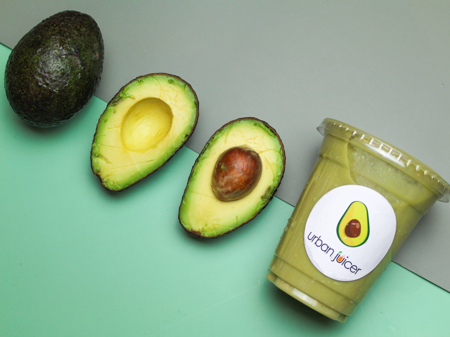
Colour corrections and damages to props caught on camera were all edited in post production using basic photo-editing software such as Adobe Photoshop and Adobe Lightroom.
Before
Water stains on the sticker
Blemishes and damage on avocado
Background and foreground colours lack vibrance
Unsaturated avocado juice
Poor colour balance.
After
Patched stains on product’s sticker
Removed blemishes on avocado
Added punch and vibrance to background & foreground
Brightened and increased saturation of avocado juice
Adjusted colour balance to better mimic reality
#ECCC69
This green-tinted yellow was the perfect flavour for the palette as it shares the freshness of the brand’s beloved avocado smoothie.
#ECCC69
This green-tinted yellow was the perfect flavour for the palette as it shares the freshness of the brand’s beloved avocado smoothie.
#ECCC69
This green-tinted yellow was the perfect flavour for the palette as it shares the freshness of the brand’s beloved avocado smoothie.
With the guidance of the colour palette along with a requested addition of a peachy-pink colour by the client, the moodboard I created gave us a detailed blueprint of the content we wanted to put out.


