Tamara Web App
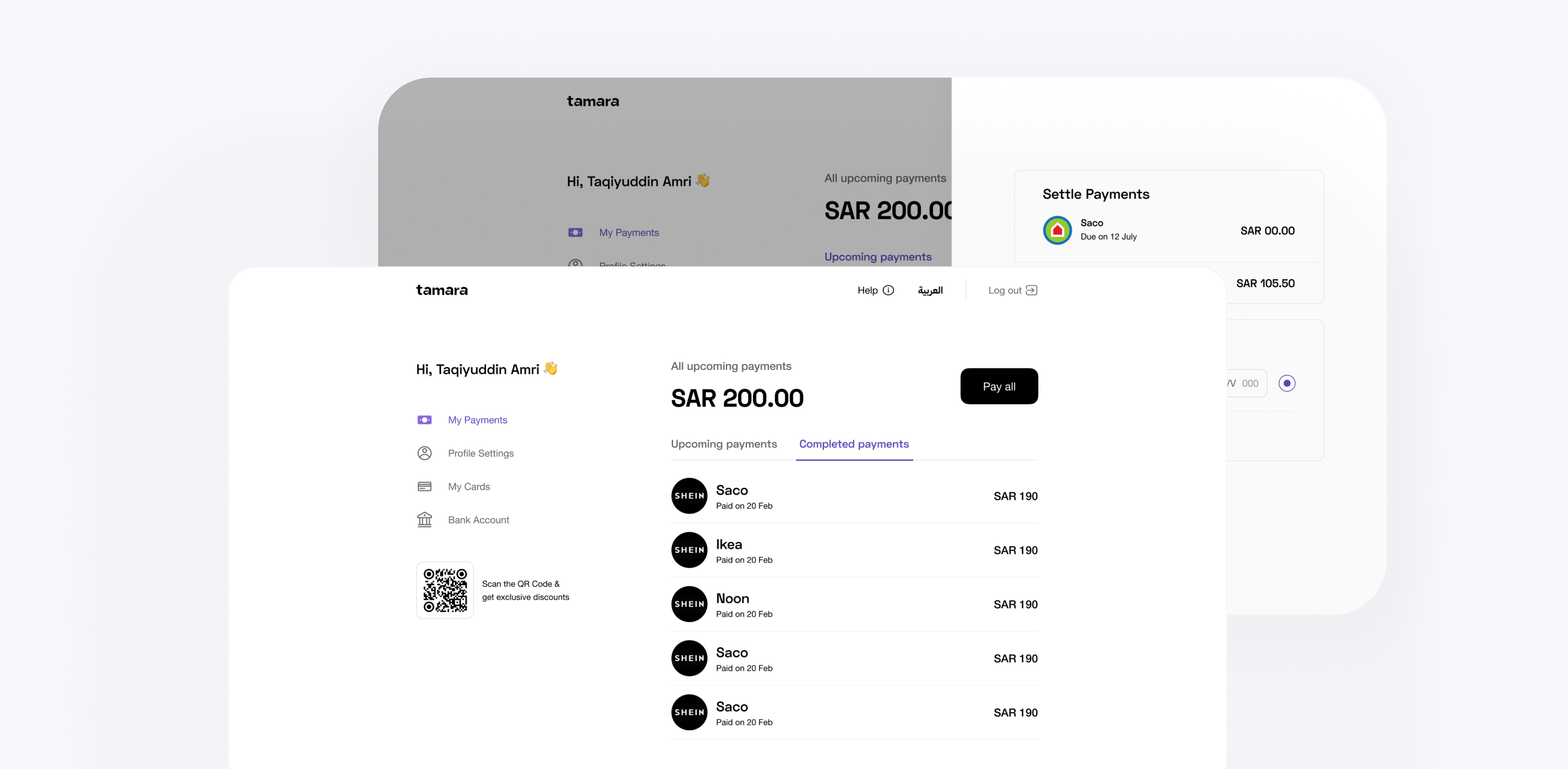
Redesigning the Tamara Web App during a full rebrand
Between 2023 and 2024, Tamara underwent a full rebrand. I was responsible for redesigning the Tamara Web App — what started as a reskin became a usability overhaul after research uncovered critical friction in the repayment flow.
The repayment flow required too many taps and didn't allow multiple installments.
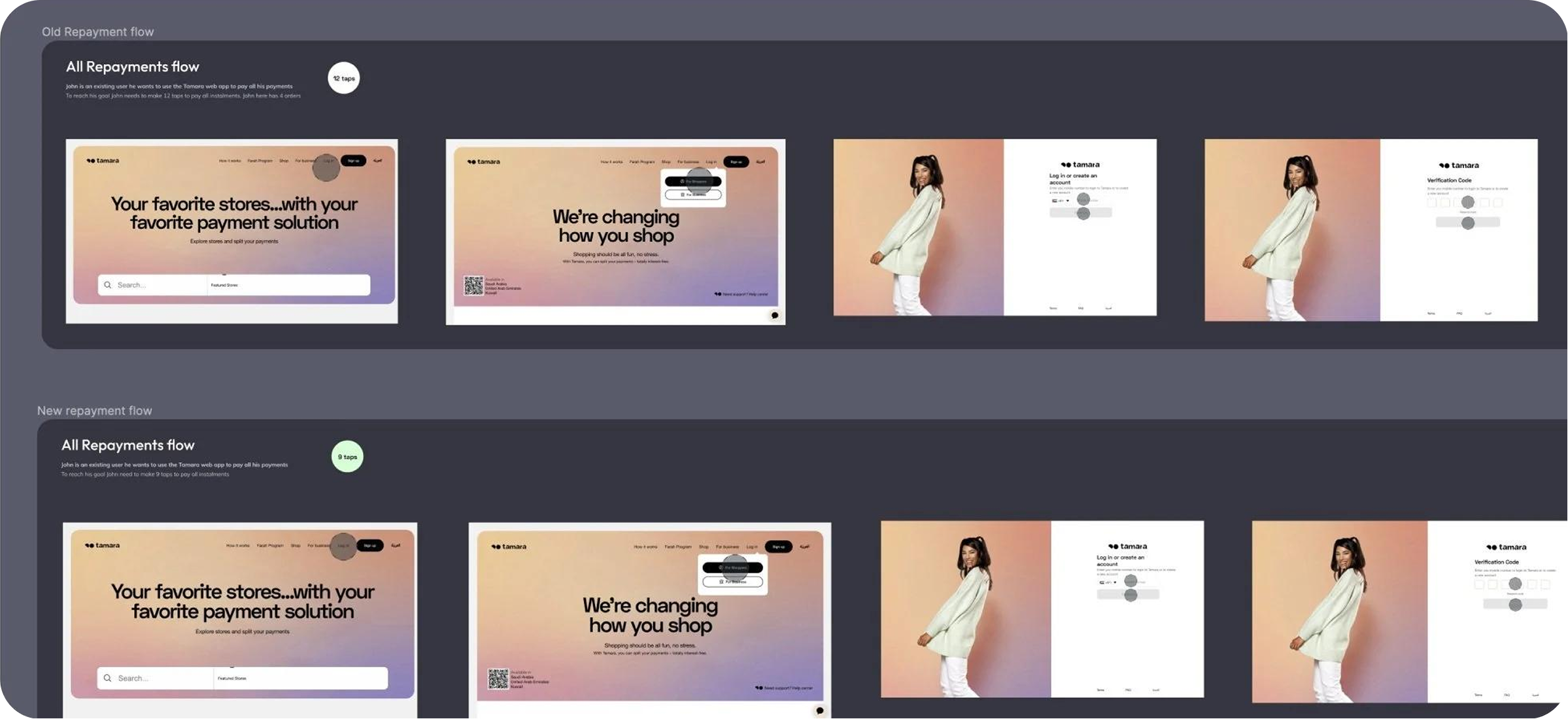
The web app's repayment flow required too many taps and didn't allow users to pay multiple installments in a single order. During the rebrand, I mapped every user flow and measured tap counts across repayment scenarios — the data made the problem impossible to ignore.
Consolidated the repayment flow and built a local design system.
I redesigned the repayment flow to consolidate steps, added multi-installment payment in a single session, built a local design system for scalability, and delivered a fully responsive mobile design — all while shipping the rebrand on schedule.
Goal
- Revamp the web app to align with Tamara's new branding for a cohesive user experience across Tamara platforms.
- Reduce steps to allow users to easily repay their instalments.
- Create a local design system to ensure scalability within the web app.
Research Phase
During the initial phase of the project, I conducted a comprehensive analysis of all user flows within Tamara's web app. One of the most critical flows identified was the repayment process, where users access the web app to pay an installment.
The analysis revealed two major usability issues:
- Users lacked an option to pay multiple installments within a single order.
- The repayment process required excessive taps, making it cumbersome.
Given the significance of this flow in the revamp, I evaluated the number of taps required for navigation across different scenarios to identify optimization opportunities.
Competitor Analysis
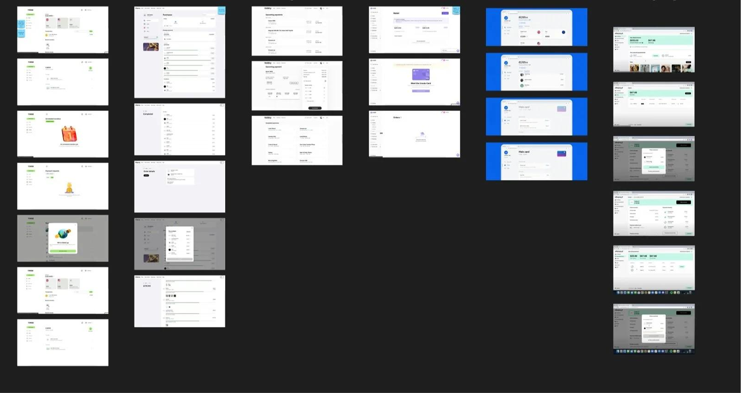
To refine our redesign, I conducted a competitive evaluation to compare Tamara's repayment flow with industry standards. This helped identify strengths, weaknesses, and best practices from competitors, providing key insights to enhance usability and streamline the repayment experience.
Wireframes
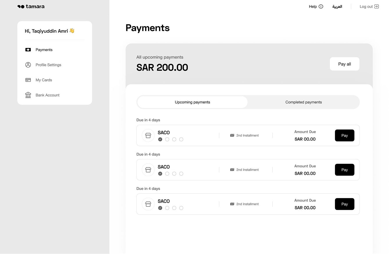
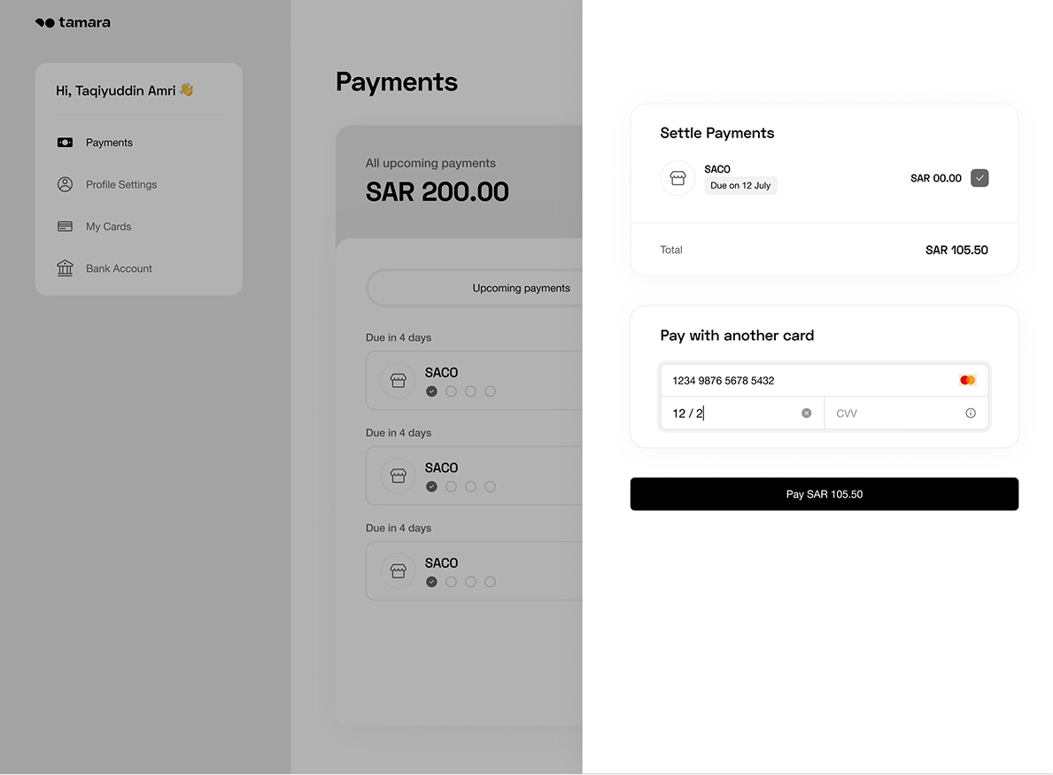
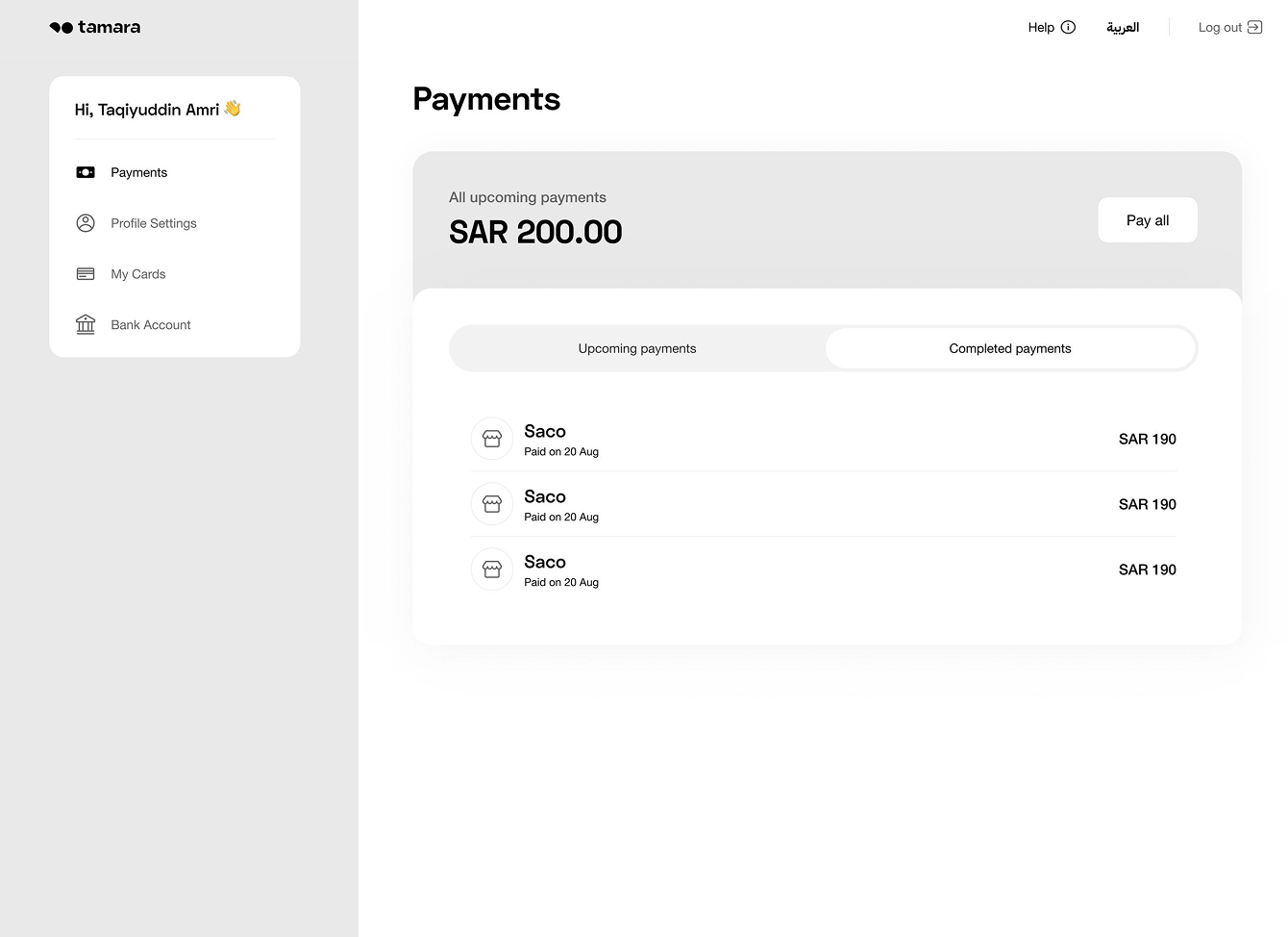
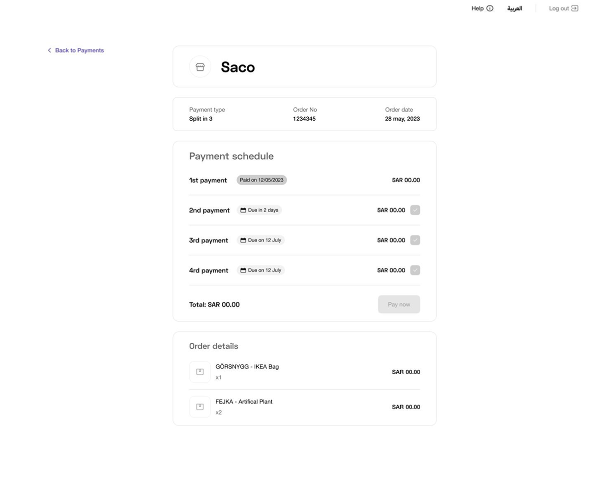
After identifying ways to streamline the repayment process by removing unnecessary pop-ups and repeated login requests, I initiated the wireframing stage. I iterated on multiple design versions to refine the new flow while also ensuring the web app aligned with Tamara's rebrand.
Stakeholder alignment
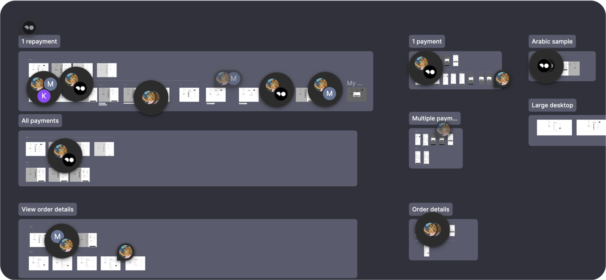
After refining the wireframes to mid-fidelity, the process of iterating, negotiating with stakeholders, and aligning began, which was both exciting and interesting. The key learning in this phase was constantly finding ways to align business needs while also resolving all user pain points.
High-Fidelity Designs
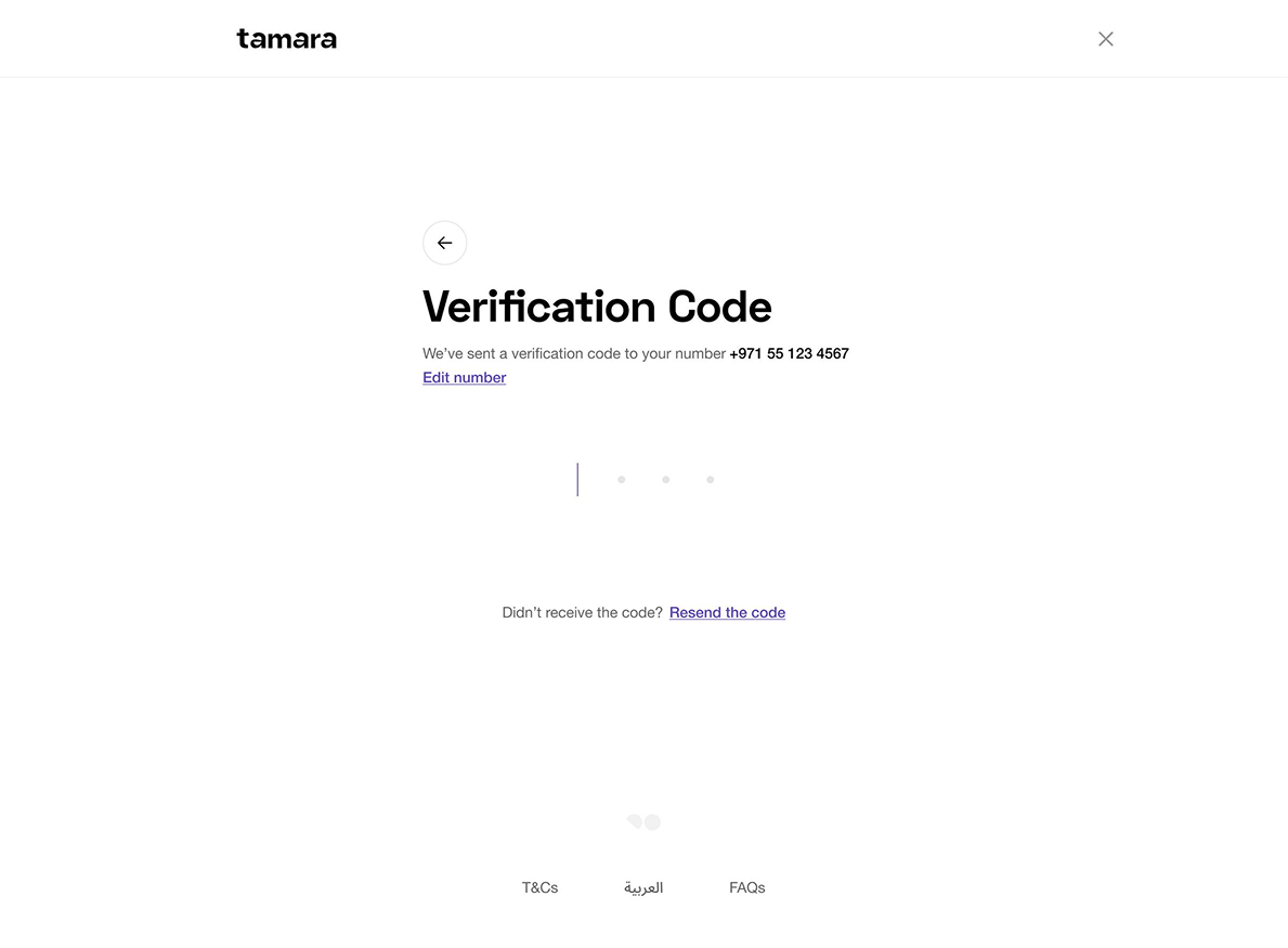
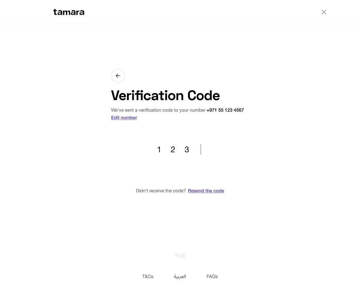
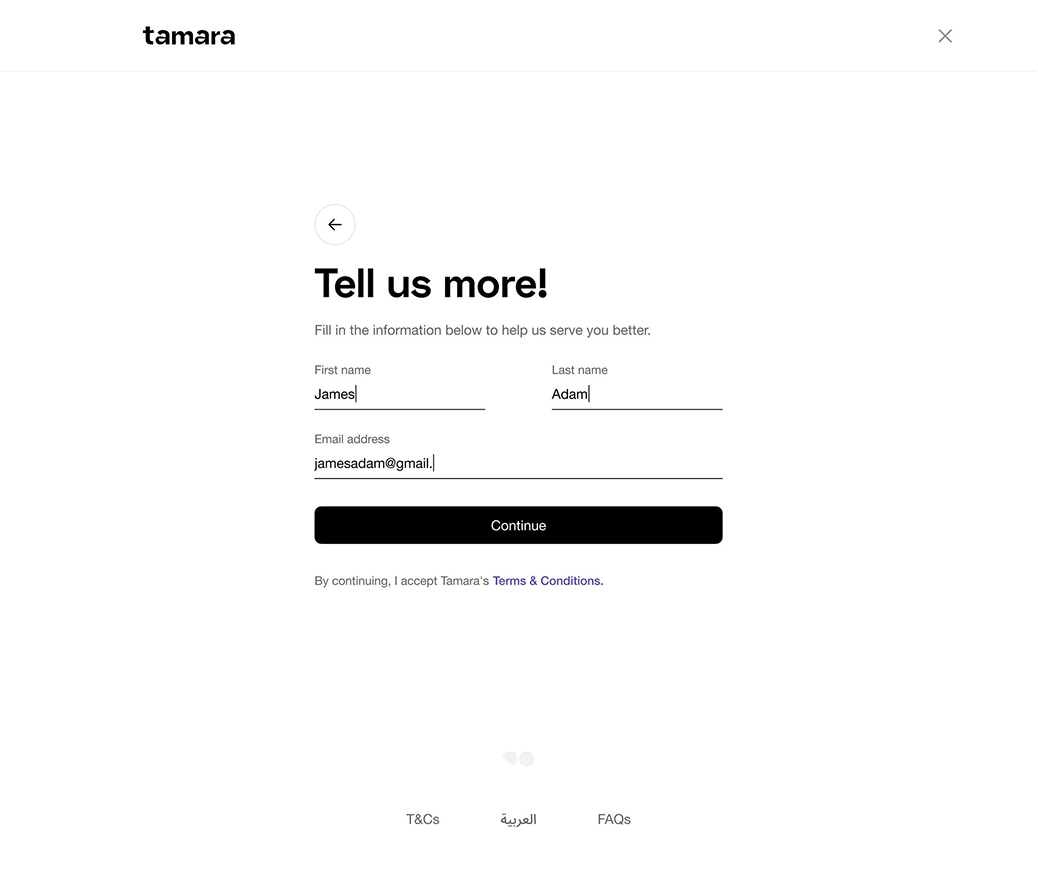
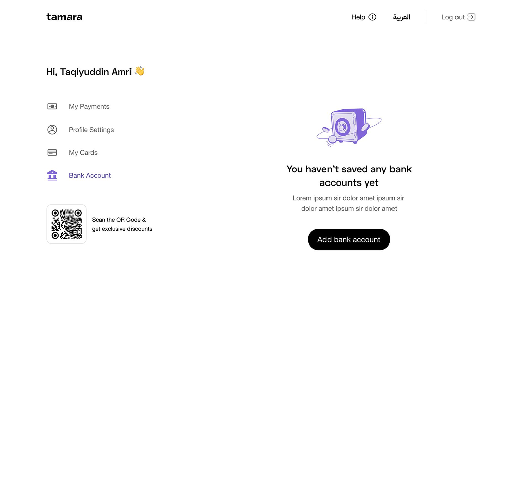
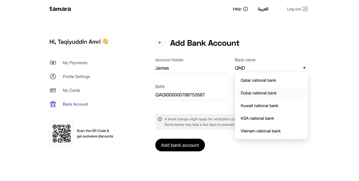
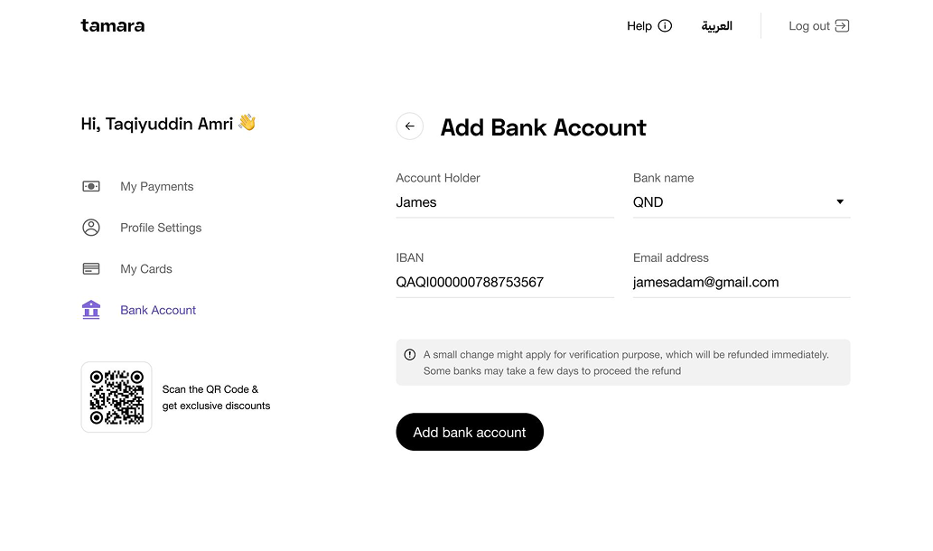
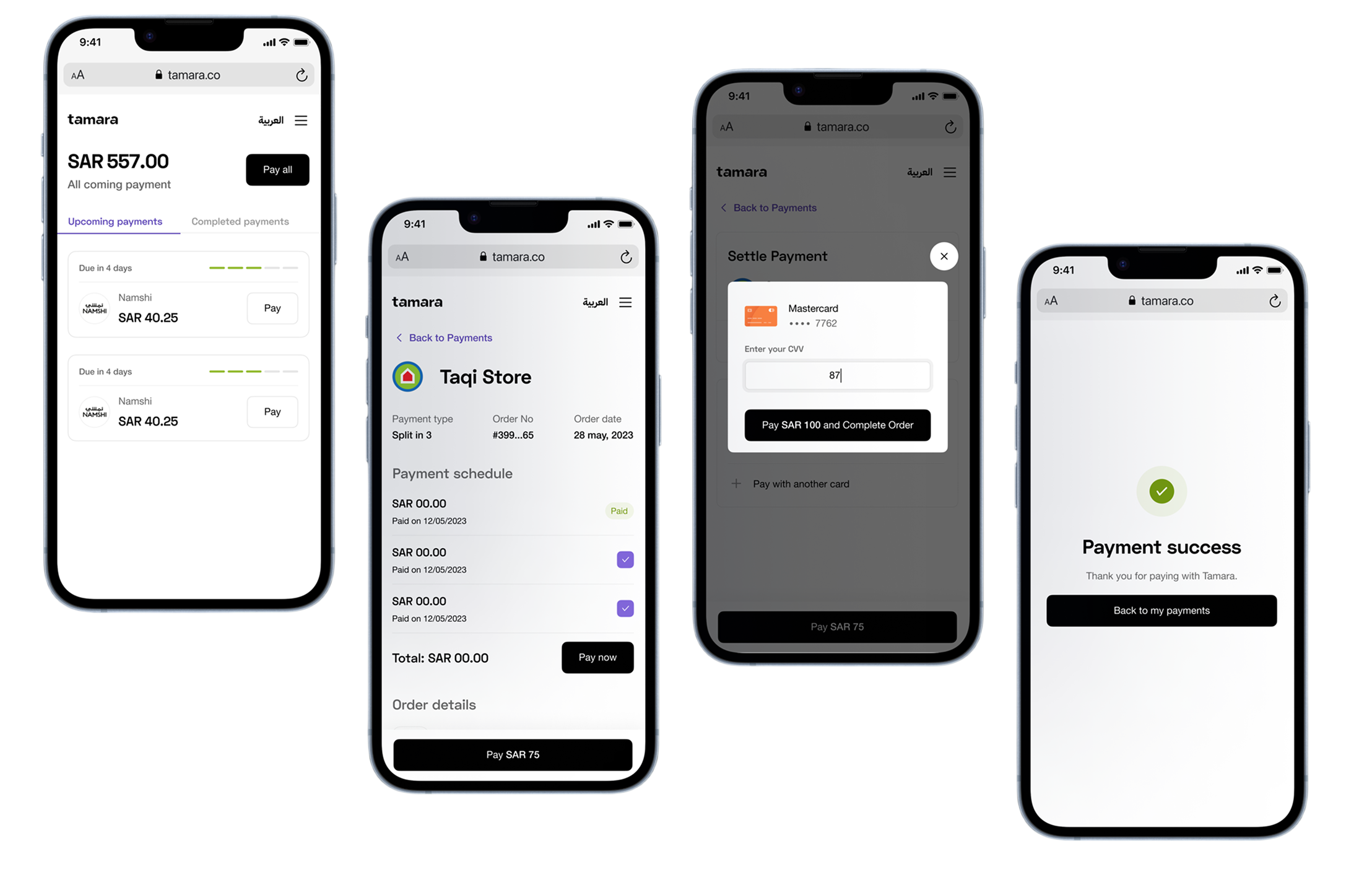
After resolving the main concerns with the mid-fidelity designs, I transitioned to creating high-fidelity designs. During this process, I focused on addressing multiple design edge cases, including mobile versions and providing screens in both English and Arabic.
Building Local Components
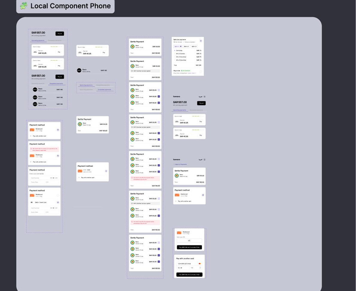
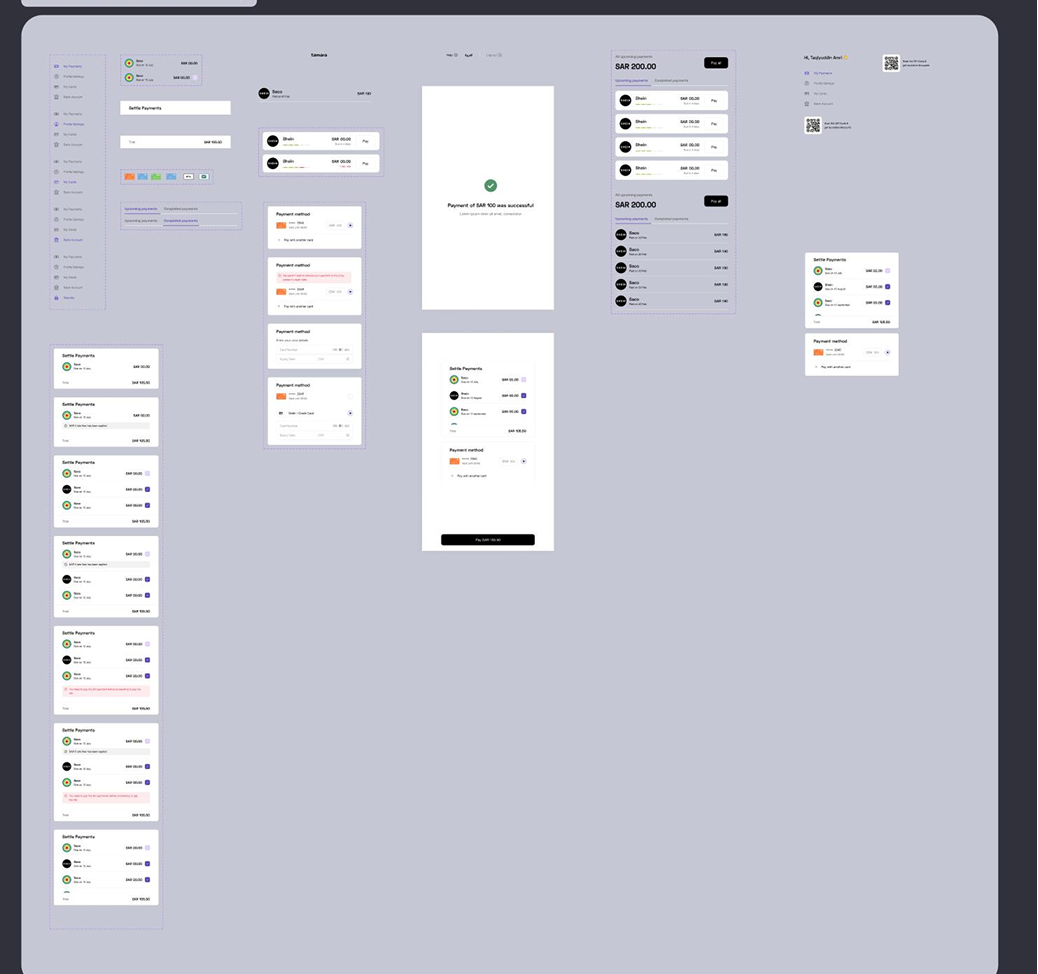
I designed this local component set to ensure scalability and consistency across both desktop and mobile experiences. By establishing a flexible and reusable system, the components adapt seamlessly to different screen sizes, maintaining a cohesive visual hierarchy and improving the overall UX.
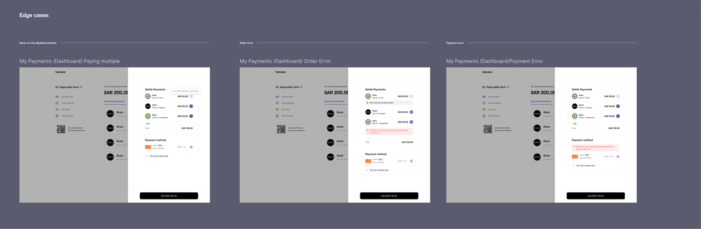
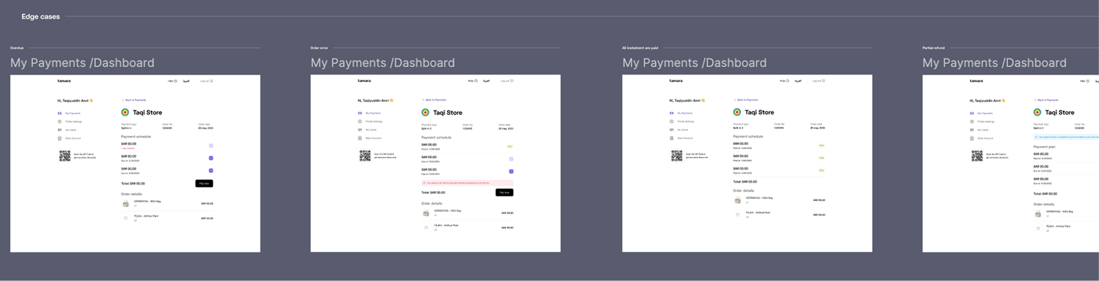
Edge cases
As part of the developer handoff process, I meticulously designed and documented all potential edge cases within this flow to ensure a seamless user experience. This includes handling payment failures, order processing errors, and variations in content display across different scenarios. Additionally, I designed responsive layouts optimized for large desktop screens and mobile devices, maintaining usability and consistency across all touchpoints.
Mobile/Responsive Design
Key Learnings
- Some friction is necessary to prevent human errors, such as accidentally tapping the pay button.
- Redesigning the entire web app was an extensive process that involved multiple stakeholder alignments across various verticals. Constant alignment with stakeholders was crucial for completing this project.